Symplifica
Redesigning formal employment for domestic workers in Colombia
Redesigning formal employment for domestic workers in Colombia
Redesigning formal employment for domestic workers in Colombia
Client
Symplifica
Team
Bianca Galli
AJ Pudlo
Ian Mcandrew
Marianne Maldonado
Role
Visual Designer
UI & UX Designer
Industries
HR Tech
Date
April 2025

CONTEXT
Empowering domestic workers through simplified employment processes
Symplifica is a Colombian platform that helps families formalise the employment of domestic workers, ensuring legal contracts, healthcare access, and protections. Despite its human-centred mission, the platform had become difficult to navigate, leading users to abandon tasks and rely heavily on the support helpline, undermining the autonomy it aimed to provide.
Our team of four joined the project for a focused, three-week design sprint. The objective was clear: to identify key usability challenges and reimagine the user experience in order to reduce reliance on customer support, improve task completion flows, and rebuild user trust in the application.

CHALLENGE
Users trusted the service, but not the interface meant to deliver it
Our initial analysis revealed four critical challenges:
Overreliance on customer support: Most users bypassed the app and sought help over the phone, which overwhelmed the support team.
Disorienting navigation: Features like registering extra hours were buried under ambiguous labels such as “Novelties”, which lacked meaning for users.
Unclear value of the Prime membership: Premium users received few visible benefits, and those they did receive were poorly communicated.
Severe drop-off in user flows: More than 80% of users abandoned the formalisation process before completion. These issues pointed to a fundamental insight: the app, intended to simplify bureaucracy, had become another source of it.
RESEARCH
Users weren’t just overwhelmed, they were emotionally uncertain
We conducted interviews with both employers and Symplifica’s internal support team to understand the emotional and practical roadblocks. Users often wanted to comply with legal responsibilities but felt uncertain, scared, or ill-informed:
“I don’t even know if my worker wants a contract or just more money.”
“If my employee gets hurt at work, I could get sued. That scares me.”
“I usually learn an app by playing around with it, but this one is too confusing.”

USER PERSONA
Designing for someone who cares deeply, but needs clarity and confidence.
Based on interview insights and behavioural patterns, we developed a user persona, Gabriela, to guide our design decisions.
Gabriela is a homeowner in El Chico who employs domestic workers informally but wants to offer them formal protections through Symplifica. Her motivations are rooted in care and responsibility, yet she’s hesitant due to high upfront costs and uncertainty about whether her employees truly value formalisation. Her experience illuminated the need for a platform that demystifies the process, offers clear value, and reduces the emotional and financial friction of doing the right thing.

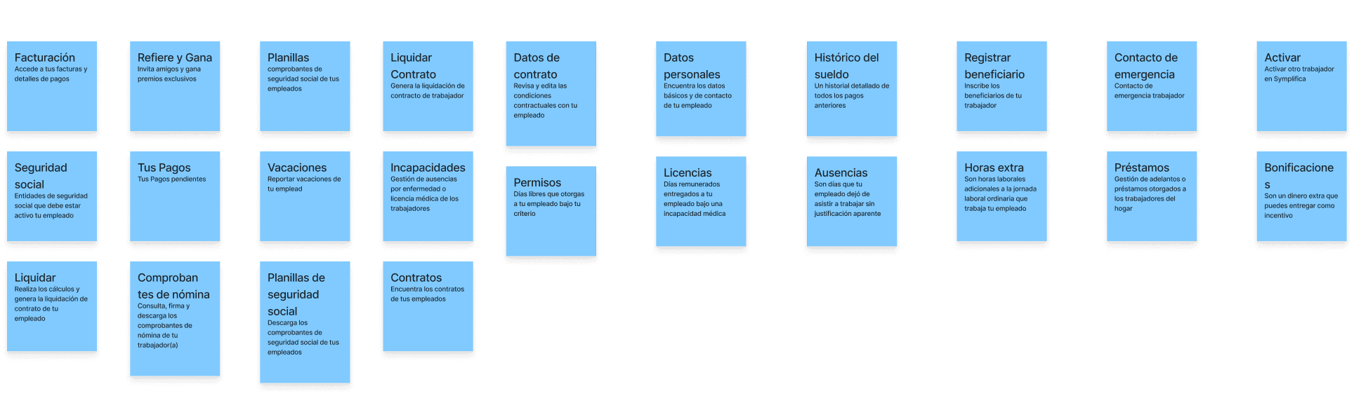
CARD SORT
People grouped features by need, not business logic
To reimagine the app’s structure, we used open card sorting with users. We asked them to categorise existing navigation items in a way that made sense to them. All participants grouped them into four intuitive categories:
Payments
Work Time
Employees
Contracts
This confirmed that the original six icon navigation bar was excessive and misaligned with user thinking. It also validated our decision to reduce the navigation bar in the redesign.
We also ran a heuristic evaluation, which revealed accessibility issues such as low contrast, inconsistent button styling, and poor information hierarchy. These weaknesses compounded users' confusion and mistrust.
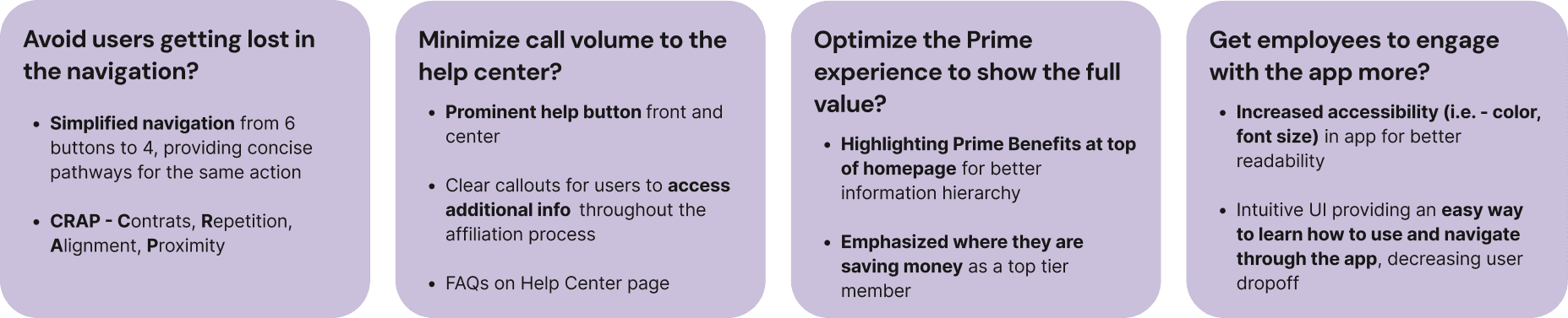
DEFINE
We reframed problems into opportunities for clarity and control
To move from insights to ideas, we created “How Might We” questions:
To move from insights to ideas, we created “How Might We” questions:

IDEATE
Reimagining the experience with empathy at the centre
With over 80% of users abandoning the employee formalisation flow, we knew this task needed to be at the heart of our redesign. We began by mapping the current process, identifying where confusion and drop-off occurred. From there, we sketched out alternative approaches as a team, exploring ways to reduce cognitive load and guide users step by step. Key ideas included progress indicators, tool tips, and embedded help features.
With over 80% of users abandoning the employee formalisation flow, we knew this task needed to be at the heart of our redesign. We began by mapping the current process, identifying where confusion and drop-off occurred. From there, we sketched out alternative approaches as a team, exploring ways to reduce cognitive load and guide users step by step. Key ideas included progress indicators, tool tips, and embedded help features.


SKETCHES
Less clutter, clearer paths, and more support at the moment it’s needed
We held collaborative sketching sessions to generate ideas around our “How Might We” statements. Key concepts we moved forward with included:
A simplified bottom navigation aligned with the mental models discovered in our research
A contextual Help Centre embedded within task flows, featuring inline FAQs
A redesigned Prime dashboard, highlighting benefits where users would see and use them
Improved onboarding cues and mirrored visual systems across the employer and employee views
REFINE
Users needed proof that they were on the right path
We built mid-fidelity wireframes to test initial layouts and navigation. These were followed by high-fidelity prototypes, incorporating visual language aligned with Symplifica’s brand.
Usability Testing
We conducted usability tests to evaluate:
Clarity on the formalise employee flow
Visibility of key information
Emotional response to tone and visuals
Key feedback:
Users felt more confident navigating the new structure
They appreciated seeing what was pending or completed at a glance
Minor tweaks were made to language and icon placement for better accessibility

SOLUTION
A platform that no longer needed to be explained by a call centre
Our redesigned interface offered the following:
A simplified, user-centred navigation structure
A guided formalisation flow with microcopy and contextual support
A more visible and valuable Prime experience
Improved accessibility in contrast, typography, and layout
A new task-focused homepage with embedded support and visual signposting
Together, these elements helped transform the app from a bureaucratic obstacle to a trusted tool.


HOW DID WE
Design Solutions: How We Addressed Key User Pain Points
We identified key user challenges and made targeted design improvements to simplify navigation, reduce support reliance, and enhance engagement. Here's how we addressed these issues.
We identified key user challenges and made targeted design improvements to simplify navigation, reduce support reliance, and enhance engagement. Here's how we addressed these issues.

NEXT STEPS
There’s still work to do, but we now know how to approach it
Looking ahead, key next steps include:
Refining the employee-side experience to match the clarity and structure of the employer view
Implementing legal and financial reminders via push notifications or homepage modules
Optimising the membership price cards to better highlight differences in pricing and benefits
Our work laid a strong foundation for these future improvements, grounded in user needs and practical, real-world scenarios.
REFLECTION
Designing for trust, clarity, and dignity
Working on Symplifica was a powerful reminder that meaningful design isn’t just about simplifying tasks, it’s about empowering people to make confident, compassionate choices. The challenge wasn’t merely to improve usability; it was to untangle a complex, emotionally charged process and rebuild it in a way that aligned with users’ values and real-world constraints. By grounding every design decision in empathy, we were able to create a more human-centred experience, one that respects the dignity of domestic workers and supports employers like Gabriela in doing the right thing. There is still more to uncover and improve, but this project affirmed that thoughtful, inclusive design can pave the way for structural change.
Working on Symplifica was a powerful reminder that meaningful design isn’t just about simplifying tasks, it’s about empowering people to make confident, compassionate choices. The challenge wasn’t merely to improve usability; it was to untangle a complex, emotionally charged process and rebuild it in a way that aligned with users’ values and real-world constraints. By grounding every design decision in empathy, we were able to create a more human-centred experience, one that respects the dignity of domestic workers and supports employers like Gabriela in doing the right thing. There is still more to uncover and improve, but this project affirmed that thoughtful, inclusive design can pave the way for structural change.